[vc_row][vc_column][vc_column_text]
Our ability to quickly notice differences is what makes contrast so powerful in UX design. Contrast attracts attention. It draws the eye. It gets noticed!
By giving your web pages characteristics that are visually different from the elements that immediately surround it, you can create points of interest and emphasis.
HOW TO USE CONTRAST TO MAKE YOUR LANDING PAGES CONVERGE?
– size
– shape
– colour
– position and orientation
When designing websites for good UX design, these elements can be contrasted to draw the eye to your most valuable proposition, product or service.
Contrast helps lead the reader’s eye through your web page. Each component of the page, graphic, textual, or interactive, has a job to do, and each of those jobs falls within a hierarchy that is specific to the project at hand, and your target client base.
In web design we are often comparing things that are similar yet different; for instance, a ‘H1’ and a ‘h1’, or an “add to cart” button and a “check out” button.
UX design is the use of such (visual) rules to make your pages easy to navigate and business effective!
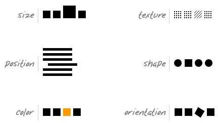
Below we present you with four key points of contrast, and how to use them to build engaging and effective landing pages that will do exactly what you want them to do:
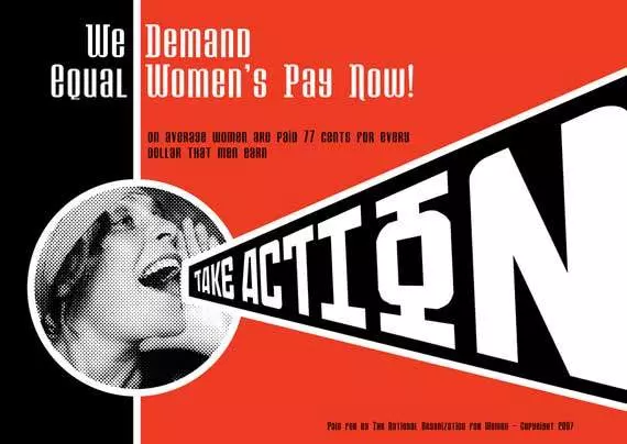
The average person is able to differentiate between more than two million different colour variations. UX design is all about using combinations of colours that pleases the eyes, get noticeable, and create interest around specific areas of your landing page.
Colour contrast simply means that a colour is perceived as different when compared to another. If two colours are different to each other (say, black and white) they have high contrast, whereas if they are very similar (red and orange) then they have low contrast.
When choosing your colours, it is also worth noting that W3C’s Web Content Accessibility Guidelines have set a minimum contrast between text and background so that it can be read by people with moderately low vision.
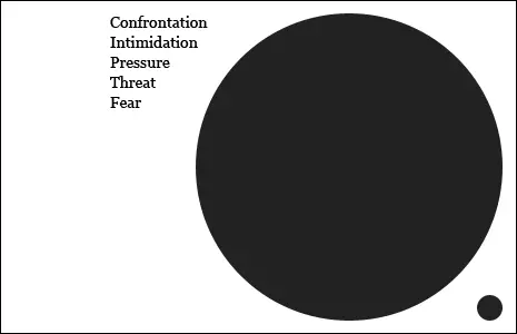
Does size matter? The answer is yes. However, it’s all relative…
In UX design, applying intelligent use of sizes (scale) between elements is a powerful tool. Bigger elements are used to indicate that something is more (or less) important than something else. When you put something big beside something small, you are indicating that the bigger item is more important, and that is used to create hierarchy in the content.
Shapes can be geometric, with clear edges (circles, squares, triangles and so on) or they can be organic, with undefined edges (such as the shapes we often find in nature).
By mixing together geometric and organic shapes, we can achieve high levels of contrast and meaning in UX design. For instance, we might view an element with a shape that’s jagged and sharp as being dangerous, when compared to the neat, smooth lines found elsewhere on the page.
Allocating contrasting shapes to different areas of your page can also help to create symmetry, or more importantly, asymmetry, an influential tool when it comes to creating a particular user experience.
The position of elements as well as their orientation can be a powerful tool to drive attention to specific areas of the website. More importantly, the way position can be used in combination with the contrast elements we have mentioned above.
If used wisely, this can be a great way of creating balance on your web page, and directing the eye to high-value areas, creating a hierarchy of elements purely by using different alignments.
If you want further information on UX design basics, check what THE USABILITY.GOV website has to say about it:
http://www.usability.
CONTRAST is a vital for UX design. However, it’s just part of your digital strategy equation.
If you think the “do it yourself” approach is a little too much. CALL THE SPECIALISTS ! At Karma Technologies Hong Kong we design, we develop and we promote your website … for your piece of mind.
And if you have found this article useful (or not), leave a comment and keep the conversation going…[/vc_column_text][/vc_column][/vc_row]
Input your search keywords and press Enter.