Responsive Web development attempts to create sites that provide the best user experience available. To accomplish this, sites must be easy to read and navigate through. If users cannot count on the same experience on their phones and tablets as their computers, they will likely turn their attention elsewhere – and fast.
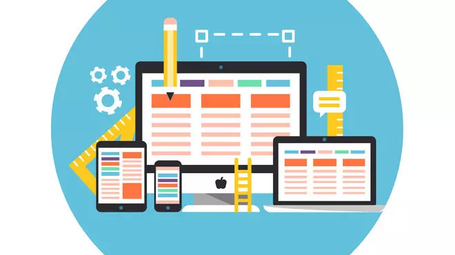
Responsive Web Development (RWD) provides a solution through an ever-growing body of web design techniques that configure a site to the relative screen size of whatever device is being used. RWD rearranges a site to provide a better user interface.
If you have an online business, this technology may already be saving and securing sales for you. If your site design incorporates RWD, your leads and conversions aren’t going to the hampered by bad web page design. This means your hard-won leads will stay longer and you have a better chance to convert them. It’s easy to see why mobile web development is focusing more and more on RWD.
Reduced bounce rate. The main reason to update to a more responsive mobile design is that most users browse your site from their smartphones or tablets. If your page takes too long to come up or the formatting is off, they will bounce to a similar site… likely a competitor.
eCommerce SEO built-in. Improving your search engine optimization (SEO) indirectly increases raw conversions by driving traffic to your site. RWD is SEO-friendly because your mobile sites can use the same content and HTML tags as your traditional website. This means RWD doesn’t require a total re-do for your mobile URL. SEO services are available to streamline these functions. If you need help customizing content in China or elsewhere, consider outsourcing responsive web design services HK.
Flexibility. With smart mobile web development, you get flexible display options. For example, your Contact Us button can lead to a URL if your lead is viewing from a desktop computer, and you can link mobile users to a phone number. Another great use of responsive techniques is to change banner links into drop downs that take up less real estate on a smartphone or tablet. This is now a common practice, so including it in your web design is critical.
Research has shown that a loading delay longer than one second can create a poor user experience. Google recommends not loading the entire page in one timeframe. Instead, paint the above-the-fold content first while the rest of the page loads. This keeps users focused and makes them willing to wait a little longer.
This is called sub-second rendering for above-the-fold content. Here are a few tips to get your mobile web development team started:
Often just thinking about your pain points when using mobile apps can help you brainstorm where to start if you’re just beginning to create or customize a tablet or smartphone version of your site. For help implementing these and other responsive web development best practices, consider reaching out to experts in the field, such as responsive web design services HK
Input your search keywords and press Enter.
 852 8199 0743