
You have implemented a brand new SEO strategy, your website traffic has increased, but the number of orders didn’t…Your web analytics software shows that your visitors are leaving the website without actually interacting with the pages…You spend precious time with customers on the phone, walking them through your online checkout process…
If you are experiencing the problems above, there’s a big chance your website is suffering from “BAD USER EXPERIENCE DESIGN”. Usability is about tailoring the right content to the right user, who has defined goals when they visit your website. In this series of 5 articles, we will present you with a set of design concepts to help you understand what makes landing pages learnable and easy to use!

When we visit websites, our attention spans to process information are finite, and our ability to multi-task is not as good as we would like it to be. On top of that, we always have a precise “mission” when we enter a page. Either to find a price or a piece of information, our attention is focused on that specific task. If after a few moments of scanning we can’t find what we need, we simply leave. For this reason, we rely on visual information and usage guidelines to help us find what we need.
Visit USABILITY.GOV to learn more about the “whats” and “whys” of user centered design.
On this brief journey for usability happiness, we will come across some design concepts, such as “the use of contrasts” and “calls to action”, that will help you better understand how people interact with webpages. The first concept on our list has created controversy over the last years, and some times can be a bone of contention between a marketing and a creative department .

The term “Above the fold” was born with newspapers. It indicates the top-half of the front page that is “above the fold” of the paper. It’s the portion of content that editors believe “sell” the newspaper. When it comes to web design, “Above the fold” refers to the portion of the web page that a visitor can see without having to scroll down.
After Nielsen reported a few years ago, that “Web users spend 80% of their time looking at information above the page fold, and only 20% below the fold”, people, especially business people, started advocating that websites should squash all the important content above a certain number of pixels, because the rest would eventually be ignored by the users.
What Nielsen Report didn’t make clear was that visitors do focus above the fold in order to find what they want (a search box or a menu navigation) but don’t mind scrolling if they like what they see above the fold.
The information you place above the fold is extremely important for the success of your landing page. However, it’s not a question of quantity. Some elements that are commonly expected above the fold, such as the company logo and the menu navigation. Other than that, a company should reserve the first fold to create interest about the page, and not worry so much if all the elements are visible without scrolling.
It’s important to understand that visitors arrive at your website with different goals and motivations in mind. Understanding who these people are and what they are looking for will help you optimize your page usability.
Bnonn Tennant, writing for Kissmetrics Blog pointed out 3 types of visitors that affect the way you display information on your pages:
Storytelling has been around for thousands of years and we can probably all remember being captivated by stories in our childhood. As stories are told we get immersed into it. Visualisation helps us memorise and emotions connect us to the characters and the storytellers.
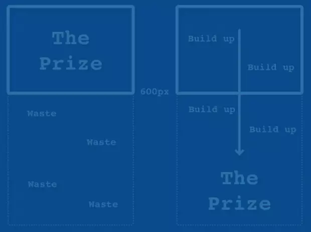
Paddy Donnelly wrote an interesting and engaging article called “Life Below 600px”, where he explains and demonstrates the myth behind the “above the fold rule” by using storytelling and beautiful graphics.
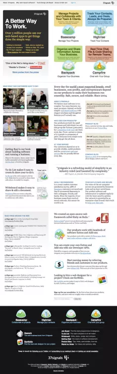
Paddy uses 37 Signals website as an example to demonstrate a successful use of story telling when creating interest around an offering.
So remember! Next time you design a landing page, learn about your visitors and their motivations. Be clear about the purpose your page has to fulfil, and tell a story about it. Wether you should place things above or below the fold will depend on your visitors, on your company and what you expect your landing page to do.
On our next article we will talk about the use of contrast for usability. And how different colours, shapes and positioning of elements can help guide your visitors interaction with your landing pages.
Was this article useful for you? Don’t forget to live us your comment or complementary information.
https://www.karmatechnologies.asia/blog/in-search-of-usability-happiness/
Input your search keywords and press Enter.