[vc_row][vc_column][vc_column_text]Your website should be usable on mobile devices such as iPhone, iPad (landscape and portrait views).
CONTACT US TO GO MOBILE WITH YOUR WEBSITE
There are different approaches to your website working on a mobile device:
-
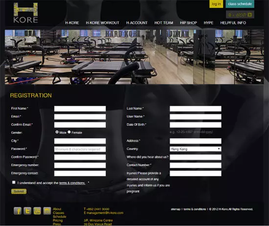
- A separate mobile website. For example www.website.com will have a separate website for a mobile device such as m.website.com.We work with you, to create wireframes, to show how the new page will look, from the original website image, for example a registration page:
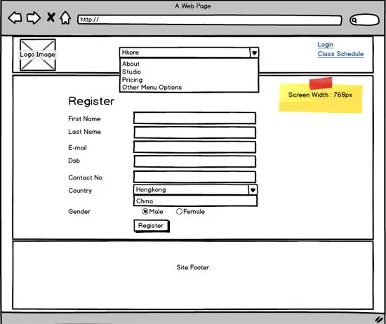
- We then construct a wireframe of the new mobile page:
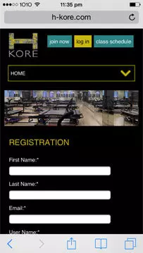
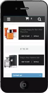
 And then build the final mobile page (the example below is on iPhone 5s screenshot):
CONTACT US TO GO MOBILE WITH YOUR WEBSITE
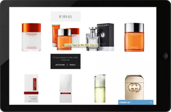
- A responsive website. This means that content is displayed differently on each mobile device however it is the same website URL.Here are some examples of how your website can look different:iPad (in Landscape view)
 iPhone (in Portrait view):
CONTACT US TO GET A RESPONSIVE WEBSITE
Let’s have a conversation
[/vc_column_text][/vc_column][/vc_row]
 852 8199 0743